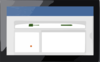
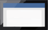
Actipro Bars - WinForms docking toolbars, menus, and statusbars Cart Not logged in Log In Register Forgot Password Resend Validation E-mail Products WPF Controls WinRT Controls Silverlight Controls WinForms Controls ASP.NET Controls Code Writer App Icons Download Evaluations Freeware Online Demos Purchase Shopping Cart Price Lists Sales FAQ Support My Account Support Tickets Knowledge Base Consulting Services Community Blog Twitter Page Discussion Forums Polls WPFpedia Company About Us Contact Us Policies Our Customers Testimonials News Room Media Kit Careers Bars for WinForms Advanced, customizable docking toolbars, menus, and statusbars Download Buy Now Feature Detail Learn More Product Overview Features Latest Release Supported Environments .NET 3.5 or later Other Notes Source Code Available Bundled in WinForms Studio Resources WinForms Blog Entries Discussion Forums More WinForms Controls Additional Benefits Thorough Documentation Help topics cover all controls and product features in detail. Numerous Samples Full-source demos and QuickStarts are included. Designer Functionality Configure the product using Visual Studio designer enhancements. The features found in Actipro Bars allow you to offer unrivaled advanced docking toolbar and menu functionality, just like what is found in industry-leading IDEs such as Visual Studio. But Bars isn't just for large applications, it can work great in small applications as well. Commands and Links The most important concept to understand with the bar controls is the concept of commands and command links. Commands represent a specific functionality of your application, such as creating a new document. A command itself does NOT have a user interface. Changes made to a command affect all the command links that reference it. A command link provides the user interface for a specific command. One or more command links can be created for each command. Changes made to command link properties only affect that particular command link instance. Numerous built-in command and command link types are included: Standard button - A standard button (on a toolbar) or menu item (on a menu), that can be pushed. It also supports a checked state. Popup button - A root menu item button (on a toolbar) or menu item (on a menu). The link has a collection of child command links that generate a child menu when the link is pressed. Split button - A split button where one part acts like a normal button and the other part has a drop-down arrow and displays a menu when pressed. The button supports a checked state. The link has a collection of child command links that generate the menu when the link is pressed. Expander button - A button that has dynamically-generated child command links. These can be a list of toolbars, windows open, or anything else. When on a toolbar, the command link functionality is similar to a popup button. When on a menu, the command link is replaced by the child command links. Label - A static label that can display text and images. TextBox - A textbox that accepts text input. ComboBox - A combobox that can display a drop-down list of pre-defined values. The combobox text area can be editable or read-only. Bar Controls Dockable ToolBars Dockable toolbars provide the basis of the bar control system. Each toolbar is a movable container for one or more command links. Dockable toolbars can be dragged by the end user and docked to any side of the host container control. When all of the command links don't fit onto a row, the toolbar can collapse and provide hidden links via the toolbar options button, or the toolbar can flow onto a new row, depending on the option set for the toolbar. A dockable toolbar in a docked state Dockable toolbars can also be floated above the host container control's form. A dockable toolbar in a floating state Global and instance options are provided so that you have precise control over what features are available to each dockable toolbar, such as the ability to close, drag, float, etc. Dockable toolbars can be set to use a full row for display. This will prevent other toolbars from being placed on the same row. Menubars are a special type of dockable toolbar. Menubars add additional MDI functionality for displaying system MDI menus and minimize/restore/close buttons of maximized standard MDI windows. They also by default don't have a gripper and will display text-only popup command links without a drop-down arrow. A menubar in a docked state Standalone ToolBars Standalone toolbars look and behave like dockable toolbars, however they can be used outside of a dock area. They can be used as a replacement for the standard Windows Forms ToolBar class. While they work like dockable toolbars, they cannot show a gripper since they are not draggable. all of the command clicks for all of the commands in your form. The orientation of the standalone toolbar can be changed to either a horizonal or vertical layout style. Popup Menus Popup menus provide pre-defined context menus that can be used in response to right-clicks on controls, and positioned at a specific point location or around a rectangle bounds. StatusBars The Bars statusbar provides a powerful alternative to the Windows Forms StatusBar class. In addition to customizable rendering, the Bars statusbar supports several panels types, each with many features. The StatusBar control Run-Time Customization One Bars' best features is the ability to optionally support complete run-time customization by the end-user. The customization features nearly match those of Visual Studio. Quick customization mode (via holding Alt) and full dialog-based customization and are available. The run-time Customize dialog The Customize dialog displays during dialog-based customization mode. It has built-in support for creating new custom dockable toolbars, creating new command links based on existing commands, and assigning keyboard shortcuts to commands. You have total control over which commands are displayed in the commands list and which commands are capable of having keyboard shortcuts assigned to them. Other Features Keyboard Shortcuts Both single hotkey and multiple hotkey (chord sequences such as Ctrl+K, Ctrl+L) shortcuts are supported for bar commands. One or more keyboard shortcuts can be assigned to each command. Application Modes An application mode is a mode that your application enters in which certain functionality should be switched on or off. In an IDE like Visual Studio, there are modes like Text Editor, Image Editor, WebBrowser, etc. In each mode certain keyboard shortcuts and dockable toolbars are used that are not used in other modes. The bar controls provide functionality for automatically displaying and hiding certain dockable toolbars as well as recognizing certain keyboard shortcuts based on what the current application mode is. MDI Support When standard MDI is used in an application and a child MDI window is maximized, its system button and other buttons (minimize, restore, and close) are optionally added to the main menu. A menubar displaying the MDI child window buttons The bar controls support the merging of command links from two different bar controls, often called as MDI merging. By indicating a merge action (such as Append, Insert, MatchOnly, Remove or Replace), you have precise control over what source command links merge with target command links. The merged command links can later be reverted, or unmerged. This is useful for MDI applications where an MDI child form provides menu items to the MDI parent form Expander commands are capable of dynamically displaying open MDI windows. When one of the command links is clicked for a specific MDI window, the MDI window is activated. Products WPF Controls WinRT Controls Silverlight Controls WinForms Controls ASP.NET Controls Code Writer App Icons Download Evaluations Freeware Online Demos Purchase Shopping Cart Price Lists Sales FAQ Support My Account Support Tickets Knowledge Base Consulting Services Community Blog Twitter Page Discussion Forums Polls WPFpedia Company About Us Our Customers Testimonials News Room Media Kit Careers Contact Us return false;
Clker.com is owned by Rolera LLC, 2270 Route 30, Oswego, IL 60543 support\at\clker\dot\com


Comments