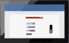
Actipro Navigation - Bundle of NavigationBar, ExplorerBar, ZoomContentControl, and Breadcrumb controls Cart Not logged in Log In Register Forgot Password Resend Validation E-mail Products WPF Controls WinRT Controls Silverlight Controls WinForms Controls ASP.NET Controls Code Writer App Icons Download Evaluations Freeware Online Demos Purchase Shopping Cart Price Lists Sales FAQ Support My Account Support Tickets Knowledge Base Consulting Services Community Blog Twitter Page Discussion Forums Polls WPFpedia Company About Us Contact Us Policies Our Customers Testimonials News Room Media Kit Careers Navigation for WPF Bundle of NavigationBar, ExplorerBar, ZoomContentControl, and Breadcrumb controls Online Demo Download Buy Now Learn More Product Overview NavigationBar Features ExplorerBar Features Breadcrumb Features ZoomContentControl Features Latest Release Supported Environments Expression Blend Other Notes Source Code Available Bundled in WPF Studio Bundled in WPF Essentials Resources WPF Blog Entries Discussion Forums More WPF Controls Additional Benefits Thorough Documentation Help topics cover all controls and product features in great detail. Numerous Samples Many full-source demos and QuickStarts are included. Designer Functionality Configure the product using Visual Studio and Expression Blend designer enhancements. Rock Solid Code All pre-obfuscated code is scanned by the VS Code Analysis tool, and warnings resolved. NavigationBar Features NavigationBar provides a facility for navigating through different panes of data. This elegant concept was introduced in Outlook, and NavigationBar implements many of the features found in Office. Panes Much like a tab control, any number of panes can be added to the NavigationBar, but only one can be selected at a time. The content of the selected pane is presented in the main area or popup of the NavigationBar. If screen real estate is available, large buttons can be used for pane selection. The end-user has the option of using a splitter to move the large buttons into the overflow button tray, which uses smaller buttons. If not all of the buttons can fit in that tray, they flow out into the overflow menu, accessible by the chevron button. Recognizable images of varying sizes can be easily associated with each pane, allowing end-users to quickly find the correct pane no matter where it's located. Minimization The NavigationBar can be minimized by the end-user to reduce it's footprint when not needed. The content of the selected pane can still be accessed while minimized, which is displayed in a popup. A minimized NavigationBar control with its content popup displayed Minimization can be set to occur on the left or right sides, depending on which side the NavigationBar is located. Customization Menu A customization menu can optionally be displayed in the overflow button area of the NavigationBar. Using this menu, the end-user can interactively show or hide the buttons for the various panes, which is useful in reducing possible clutter. A NavigationBar control with its customize menu open The customization menu is populated with default menu items, but items can be easily added or removed based on your needs. Options Window A built-in Options window comes packaged with NavigationBar, that allows the user to reorder the navigation pane buttons. Navigation pane buttons can also be shown or hidden by checking and unchecking the items in the list, respectively. The visibility and sort order can be reset back to defaults by clicking the Reset button. The options window of a NavigationBar control Containers The NavigationBar has an option to hide its pane buttons. Using this option, you can mimic a simple container that has the NavigationBar appearance. This can be useful to give your application a consistent look throughout. A NavigationBar control with a single pane and the buttons hidden NavigationBar also includes several styles for the WPF Expander control. The styles use fade and slide animations during expand and collapse operations to make the more visually appealing. One style mimic the sub-header panel look found in Outlook, while another mimics the expanders found in Windows 7. A native WPF Expander with the Outlook expander style applied MVVM Support The NavigationBar can be bound to a list of custom data items, and as such fully supports the Model-View-ViewModel (MVVM) pattern. Layout Serialization Customizations by the end-user can be easily saved out to an XML format and restored later. You can choose to save the XML to a file or a string, which gives you full control over where to persist the user's settings. Globalization This control fully supports right-to-left layouts and user interface resource string customization. Products WPF Controls WinRT Controls Silverlight Controls WinForms Controls ASP.NET Controls Code Writer App Icons Download Evaluations Freeware Online Demos Purchase Shopping Cart Price Lists Sales FAQ Support My Account Support Tickets Knowledge Base Consulting Services Community Blog Twitter Page Discussion Forums Polls WPFpedia Company About Us Our Customers Testimonials News Room Media Kit Careers Contact Us return false;
Clker.com is owned by Rolera LLC, 2270 Route 30, Oswego, IL 60543 support\at\clker\dot\com


Comments